

Are you intrigued by the world of finance but feel overwhelmed by the seemingly complex realm of the stock market? Navigating the ups and downs of the market can be daunting, especially for beginners. But what if we told you that unlocking the secrets of stock market charts can be your key to making informed investment decisions? This beginner’s guide will equip you with the essential knowledge to decipher the visual language of stock charts, empowering you to analyze trends and identify potential opportunities.
Many believe that deciphering stock market charts is an exclusive skill reserved for seasoned investors. However, understanding the fundamentals of chart analysis is within reach for anyone with a desire to learn. Through practical explanations and easy-to-understand examples, this guide will demystify the world of technical analysis, providing you with the tools to make confident decisions about your investments. Get ready to unravel the hidden patterns and insights within stock charts and embark on your journey towards financial literacy.
Introduction to Stock Market Charts
Stock market charts are visual representations of price movements over time. They provide a wealth of information about a stock’s performance, trends, and patterns, which can help investors make informed decisions. Understanding how to read and interpret these charts is crucial for any investor, regardless of experience level.
There are various types of charts used in stock market analysis, each with its unique strengths and weaknesses. Some of the most common include:
- Line Charts: These charts connect closing prices with a line, showcasing the overall trend of the stock’s price movement.
- Bar Charts: These charts display the high, low, open, and close prices of a stock for a specific period, providing a more detailed view of price fluctuations.
- Candlestick Charts: These charts resemble bar charts but use different visual elements (candlesticks) to represent price data, offering more nuanced insights into market sentiment.
Charts are a powerful tool for analyzing stock market data and identifying potential investment opportunities. They can help investors:
- Spot trends: Charts reveal patterns and trends that may not be obvious from looking at raw data alone.
- Identify support and resistance levels: Charts highlight price levels where buying and selling pressure is typically strong, providing insights into potential turning points.
- Gauge market sentiment: Charts can provide visual clues about investor confidence and market psychology.
While charts can be a valuable resource, it’s important to remember that they are just one piece of the puzzle. It’s essential to combine chart analysis with fundamental research, news analysis, and other factors before making investment decisions.
Types of Charts: Line, Bar, and Candlestick
Understanding how to read stock market charts is essential for making informed investment decisions. Among the many types of charts available, three stand out as particularly useful for beginners: line charts, bar charts, and candlestick charts.
Line Charts
Line charts are the simplest form of stock market charts. They display the price of a security over time, connecting each data point with a line. The X-axis represents time, while the Y-axis represents price. Line charts are easy to understand and can quickly reveal trends in stock prices. They are particularly useful for identifying long-term trends, such as uptrends and downtrends.
Bar Charts
Bar charts are similar to line charts, but instead of connecting data points with a line, they use vertical bars. The height of each bar represents the price of the security for a specific period, such as a day or a week. Bar charts can be helpful for visualizing the open, high, low, and closing prices of a security. This can provide a clearer picture of price fluctuations and volatility.
Candlestick Charts
Candlestick charts are more visually complex but offer more information than line or bar charts. Each candlestick represents a specific time period, such as a day or a week. The body of the candlestick represents the difference between the opening and closing prices. The wick, or shadow, extends above and below the body and represents the high and low prices for that period.
Candlestick charts are particularly useful for identifying reversal patterns and price momentum. They can also provide insight into market sentiment and the strength of buyers and sellers.
Learning to read stock market charts takes time and practice. Start with the basics and gradually work your way up to more complex chart patterns. By understanding these different types of charts, you can gain valuable insights into stock market trends and make more informed investment decisions.
Understanding Chart Axes and Timeframes
Before you start deciphering the intricate patterns of stock market charts, it’s crucial to understand the fundamental building blocks: axes and timeframes. These elements provide the context for analyzing price movements and identifying potential trends.
The vertical axis, often referred to as the y-axis, represents the price of the asset being charted. It usually displays the price range from the lowest to the highest point within the chosen timeframe. The horizontal axis, or x-axis, represents the time, which can be displayed in various intervals:
- Intraday: This timeframe displays price fluctuations within a single trading day, typically in minutes or hours.
- Daily: This shows the daily opening, high, low, and closing prices.
- Weekly: This presents price data for each week.
- Monthly: This offers a broader view of price movements over a month.
- Yearly: This timeframe showcases price changes across an entire year.
Choosing the right timeframe depends on your trading strategy and the information you’re looking for. Short-term traders often focus on intraday or daily charts to identify quick price swings, while long-term investors might prefer monthly or yearly charts to gauge long-term trends.
Understanding the interplay between axes and timeframes is essential for navigating the world of stock market charts. By recognizing the different time scales and price ranges, you can gain valuable insights into market behavior and make informed trading decisions.
Key Price Indicators: Open, High, Low, Close
Understanding the fundamental components of a stock chart is essential for any aspiring investor. Among the key price indicators, the Open, High, Low, and Close prices play a crucial role in deciphering the price action of a stock over a specific period.
The Open price represents the first traded price of a stock when the market opens. It’s the starting point for the trading day’s price movement.
The High price signifies the highest price achieved by the stock throughout the trading day. It indicates the strongest buying pressure during the period.
The Low price, on the other hand, represents the lowest price reached by the stock during the trading day. It highlights the strongest selling pressure during the same period.
Finally, the Close price denotes the last traded price of a stock before the market closes for the day. It provides a snapshot of the stock’s final value for the trading session.
These four price indicators are often visualized as a bar or candlestick on a stock chart, offering a visual representation of the price fluctuations throughout the trading day. By analyzing these indicators, investors can gain valuable insights into the stock’s overall trend, momentum, and volatility.
Volume and Its Significance
In the realm of stock market charts, volume serves as a crucial indicator that sheds light on the intensity of trading activity. It represents the number of shares traded during a specific period, typically a day, week, or month. Understanding volume is essential for investors and traders alike, as it provides valuable insights into the market’s sentiment and potential future price movements.
High volume often indicates strong conviction in a particular stock, suggesting that a large number of traders are actively participating in the market. This can be a sign of bullish or bearish sentiment, depending on the direction of price movement. Conversely, low volume may signal apathy or indecision, indicating that traders are not actively buying or selling the stock.
One of the most significant aspects of volume is its ability to confirm price trends. When prices rise or fall on high volume, it strengthens the belief that the trend is likely to continue. However, if a price move is accompanied by low volume, it may be a weak signal and could easily be reversed.
Volume divergence is another important concept. This occurs when the price of a stock moves in one direction, while volume moves in the opposite direction. For example, if the price of a stock is rising but volume is declining, it could suggest that the rally is losing momentum and may soon reverse.
In conclusion, volume is an indispensable tool for investors and traders. By analyzing volume data, one can gain valuable insights into market sentiment, confirm price trends, identify potential reversals, and make more informed trading decisions. While it’s not a perfect indicator, when used in conjunction with other technical analysis tools, it can significantly enhance your ability to navigate the complexities of the stock market.
Moving Averages: Identifying Trends
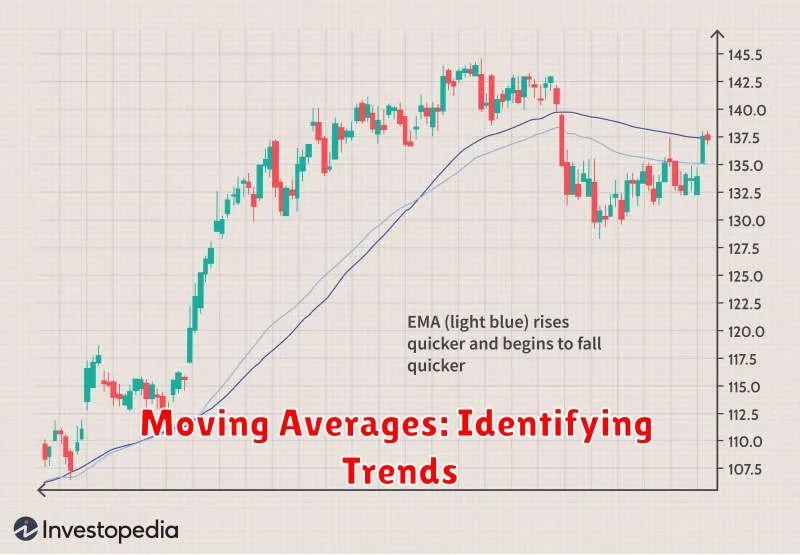
Moving averages are powerful tools used by traders to identify trends and potential turning points in the stock market. They smooth out price fluctuations, providing a clearer picture of the underlying trend. There are different types of moving averages, each with its own unique characteristics and applications.
Simple Moving Average (SMA): This is the most basic type of moving average. It’s calculated by averaging the closing prices of a stock over a specific period, such as 10 days, 20 days, or 50 days. A longer-term SMA (e.g., 50-day) is typically used to identify major trends, while a shorter-term SMA (e.g., 10-day) can help spot shorter-term price fluctuations.
Exponential Moving Average (EMA): The EMA gives more weight to recent prices, making it more responsive to changes in the market. This is because it places a greater emphasis on the most recent data points. A higher weighting factor is assigned to more recent prices, while older prices have a smaller impact on the average.
Crossovers and Trend Identification: One of the most common ways to use moving averages is to identify crossovers. When a shorter-term moving average crosses above a longer-term moving average, it can signal a potential bullish trend. Conversely, a crossover below can indicate a bearish trend.
Key Considerations: It’s important to remember that moving averages are lagging indicators, meaning they are based on past price data. They can’t predict future price movements, but they can help you understand the current trend and identify potential turning points. It’s crucial to combine moving averages with other technical analysis tools and fundamental analysis to make well-informed trading decisions.
Support and Resistance Levels
Support and resistance levels are key concepts in technical analysis, which is the study of price charts to identify patterns and trends in financial markets. These levels represent price points where buying and selling pressure are expected to be strong, potentially influencing the direction of a stock’s price.
Support levels are price points where buying pressure is expected to be strong enough to prevent further price declines. Think of them as a “floor” for the stock price. When a stock’s price reaches a support level, buyers are more likely to step in and purchase the stock, preventing it from falling further.
Resistance levels, on the other hand, are price points where selling pressure is expected to be strong enough to prevent further price increases. They act as a “ceiling” for the stock price. When a stock’s price reaches a resistance level, sellers are more likely to sell, preventing the price from rising further.
Identifying support and resistance levels can be helpful for traders in several ways:
- Entry and exit points: Traders may use support and resistance levels to identify potential entry and exit points for their trades. For example, a trader might buy a stock near a support level, expecting it to bounce back up. Or, they might sell a stock near a resistance level, expecting it to decline.
- Trend confirmation: Breakouts above resistance levels or breakdowns below support levels can confirm an existing trend or signal a new trend.
- Risk management: Support and resistance levels can also be used to set stop-loss orders. Stop-loss orders are orders to automatically sell a stock if it falls below a certain price, limiting potential losses.
It’s important to note that support and resistance levels are not absolute guarantees. There are instances where prices can break through these levels, particularly in volatile markets. However, they can still provide valuable insights into market sentiment and potential price action.
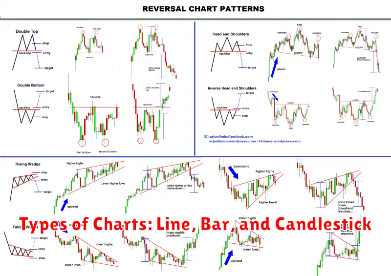
Chart Patterns: Recognizing Bullish and Bearish Signals
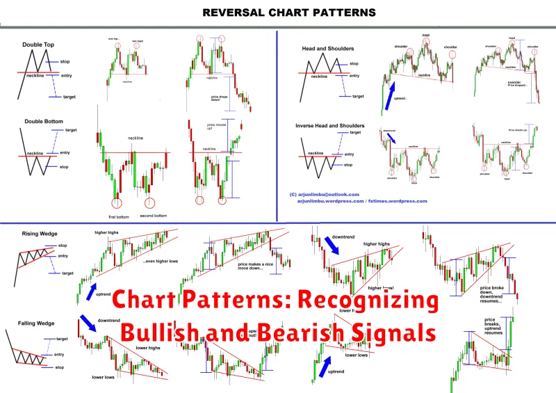
Chart patterns are visual representations of price movements on a stock chart. They can be used to identify potential bullish or bearish signals, providing valuable insights into the future direction of a stock. Recognizing these patterns requires practice and understanding of how market sentiment and trading activity are reflected in the chart.
Bullish Chart Patterns
Bullish patterns suggest that the price of a stock is likely to rise. Some common bullish patterns include:
- Head and Shoulders: A pattern that resembles a head with two shoulders on either side, indicating a potential reversal of a downtrend.
- Double Bottom: A pattern where the price of a stock touches a certain level twice, suggesting a potential bounce back.
- Cup and Handle: A pattern that looks like a cup with a handle, indicating a period of consolidation followed by an upward breakout.
Bearish Chart Patterns
Bearish patterns suggest that the price of a stock is likely to fall. Some common bearish patterns include:
- Inverse Head and Shoulders: The opposite of a Head and Shoulders pattern, indicating a potential continuation of a downtrend.
- Double Top: A pattern where the price of a stock reaches a certain level twice, suggesting a potential reversal of an uptrend.
- Triple Top: Similar to a Double Top, but with three peaks, indicating a stronger bearish signal.
Using Chart Patterns
It’s important to note that chart patterns are not foolproof indicators. They should be used in conjunction with other technical analysis tools and fundamental analysis. Additionally, the size and clarity of the pattern can influence its reliability.
By understanding these patterns, traders can identify potential opportunities to buy or sell stocks, potentially improving their trading decisions and maximizing profits. It’s essential to practice and gain experience in interpreting chart patterns to make informed trading decisions.
Technical Analysis Tools for Chart Reading
Technical analysis is a method of evaluating securities by analyzing past market data, primarily price and volume. It attempts to forecast future price movements by identifying patterns and trends in these data. Technical analysts use a variety of tools to achieve this, and these tools are essential for any trader or investor seeking to gain an edge in the market. Let’s dive into some of the most common and effective technical analysis tools.
Moving Averages: Moving averages are one of the most basic yet powerful tools in technical analysis. They smooth out price fluctuations and help identify trends. A moving average is calculated by averaging the closing prices of a security over a specified period. Common types include simple moving averages (SMA), exponential moving averages (EMA), and weighted moving averages (WMA).
Relative Strength Index (RSI): The RSI is a momentum indicator that measures the magnitude of recent price changes to evaluate overbought or oversold conditions in the price of a stock or other asset. It is a popular momentum indicator that can help identify overbought and oversold conditions, which can be used to make trading decisions. An RSI value above 70 is considered overbought, and a value below 30 is considered oversold.
MACD (Moving Average Convergence Divergence): The MACD is a trend-following momentum indicator that shows the relationship between two moving averages of prices. It can be used to identify changes in the strength, direction, and momentum of a trend. The MACD is calculated by subtracting the 26-period exponential moving average (EMA) from the 12-period EMA. A crossover of the MACD line above its signal line can indicate a bullish trend, while a crossover below the signal line can indicate a bearish trend.
Support and Resistance: These are price levels where the price of an asset tends to stall or reverse. Support levels are areas where the price is expected to find buying interest, while resistance levels are areas where the price is expected to find selling interest. These levels can be identified using historical data and can be used to make trading decisions.
Candlestick Patterns: Candlestick patterns are graphical representations of price movements over a specific period. These patterns can be used to identify trends, reversals, and potential support and resistance levels. Some popular candlestick patterns include the hammer, the shooting star, the engulfing pattern, and the doji.
Volume: Volume is the number of shares or contracts traded in a given period. It can be used to confirm trends, identify breakouts, and gauge the strength of a move. High volume can indicate strong buying or selling pressure, while low volume can indicate weak interest.
Remember, technical analysis is just one piece of the puzzle when it comes to making trading decisions. It’s important to combine technical analysis with fundamental analysis and your own risk tolerance to create a sound trading strategy.
Putting It All Together: Making Informed Trading Decisions

Now that you’ve learned the basics of reading stock market charts, it’s time to put it all together and make informed trading decisions. It’s important to remember that technical analysis is just one piece of the puzzle. You also need to consider fundamental analysis, which looks at the underlying company’s financials and future prospects.
When making trading decisions, consider the following:
- Identify your goals: What are you hoping to achieve with your trading? Are you looking for short-term gains or long-term growth?
- Develop a trading strategy: Based on your goals, create a plan that outlines your entry and exit points, risk management, and trading frequency.
- Choose your indicators wisely: Not all indicators are created equal. Select the ones that are relevant to your trading style and the markets you’re trading.
- Practice patience: Don’t rush into trades. Let the charts tell you when the right time to buy or sell is.
- Manage your risk: Never invest more than you can afford to lose. Use stop-loss orders to limit your potential losses.
- Be disciplined: Stick to your trading plan and don’t let emotions cloud your judgment.
- Learn from your mistakes: Everyone makes mistakes. Don’t let them discourage you. Analyze your trades and learn from your errors.
Remember, trading is a marathon, not a sprint. By understanding the fundamentals and applying technical analysis correctly, you can increase your chances of success. However, always do your own research and consult with a financial advisor before making any investment decisions.